The Shoebox Experiences
The Shoebox Experiences
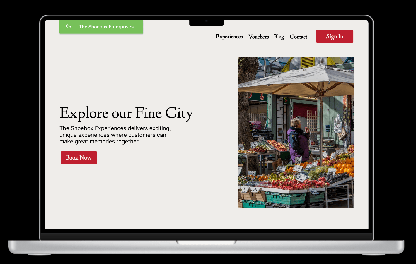
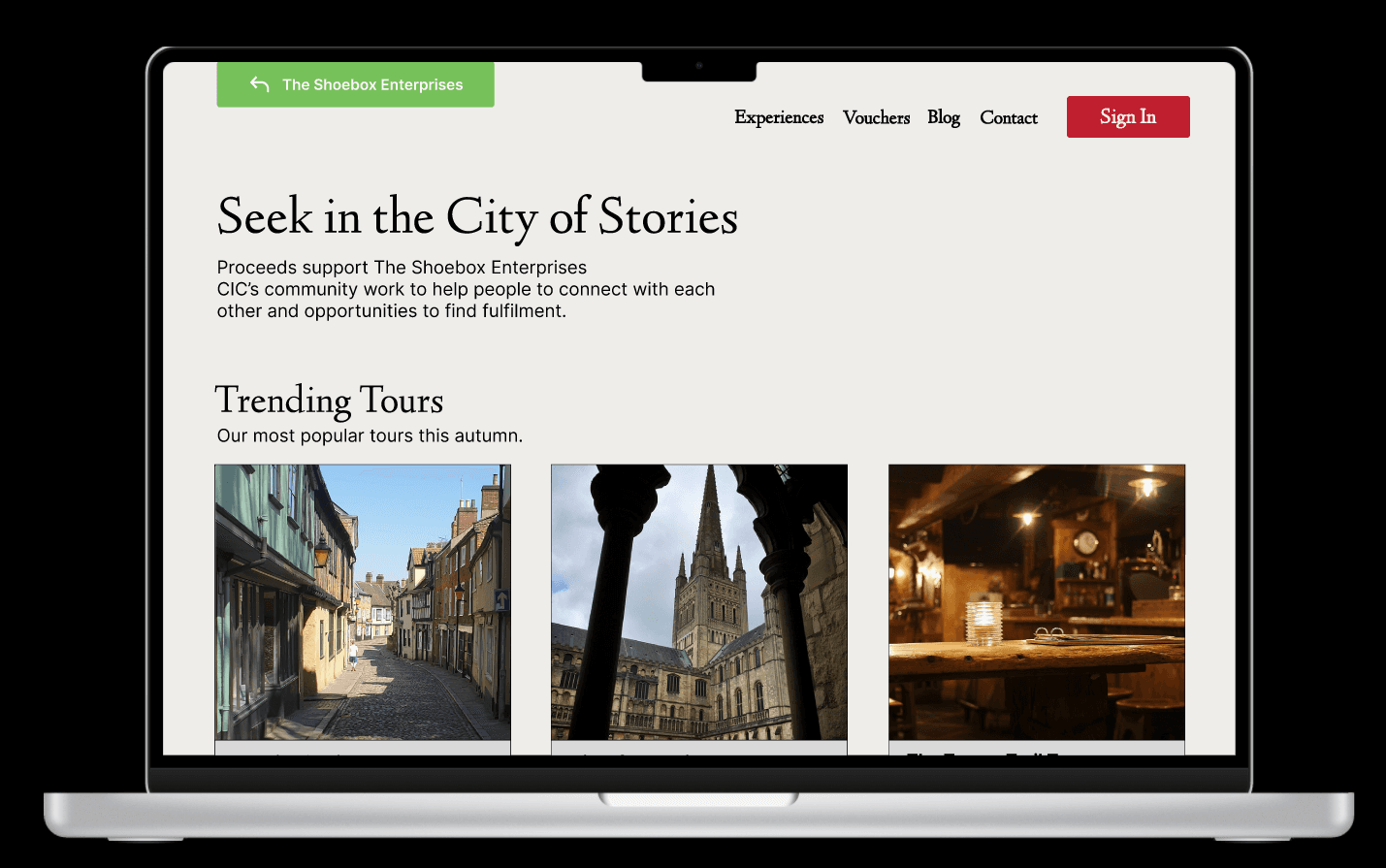
This was for my Year 2 Project 2 where I chose a website to analyze and re-design. I undertook this project alongside my classmates that consisted of three parts: generative research, prototyping, and execution. My goal was to develop an web application that would allow users to book tours through the Shoebox Experiences more efficiently with a higher rate of customer satisfaction.
Client
NUA Brief 2
Year
2024
Category
Web Design
Introduction
Introduction
Many local tourism websites suffer from poor design, outdated information, and limited accessibility. This case study explores the process of redesigning a Norwich tour website to enhance user experience, accessibility, and usability. The goal was to create an intuitive, inclusive, and engaging platform for tourists and locals alike.
Many local tourism websites suffer from poor design, outdated information, and limited accessibility. This case study explores the process of redesigning a Norwich tour website to enhance user experience, accessibility, and usability. The goal was to create an intuitive, inclusive, and engaging platform for tourists and locals alike.
Introduction
Many local tourism websites suffer from poor design, outdated information, and limited accessibility. This case study explores the process of redesigning a Norwich tour website to enhance user experience, accessibility, and usability. The goal was to create an intuitive, inclusive, and engaging platform for tourists and locals alike.
Problem
Problem
The existing Norwich Shoebox Experiences tour website faced several challenges:
Lack of accessibility features: No screen reader support, poor color contrast, and small font sizes.
Complex navigation: Users found it difficult to locate essential information such as tour schedules and pricing.
Outdated design: The website was cluttered and visually unappealing.
Non-responsive layout: It was not optimized for mobile users, making it difficult to browse on smaller screens.
Problem
The existing Norwich Shoebox Experiences tour website faced several challenges:
Lack of accessibility features: No screen reader support, poor color contrast, and small font sizes.
Complex navigation: Users found it difficult to locate essential information such as tour schedules and pricing.
Outdated design: The website was cluttered and visually unappealing.
Non-responsive layout: It was not optimized for mobile users, making it difficult to browse on smaller screens.
Research and User Insights
Research and User Insights
To identify key pain points and user needs, I conducted:
User surveys: Feedback from tourists, local residents, and individuals with disabilities.
Competitive analysis: Evaluation of best practices from other tourism websites.
Usability testing: Observing users interacting with the current site to identify friction points.
Based on my findings, I established the following objectives:
Improve accessibility: Ensure compliance with WCAG 2.1 guidelines.
Simplify navigation: Implement a clear, structured menu.
Enhance aesthetics: Use a modern, visually appealing design.
Optimize performance: Improve page load times and SEO.
Research and User Insights
To identify key pain points and user needs, I conducted:
User surveys: Feedback from tourists, local residents, and individuals with disabilities.
Competitive analysis: Evaluation of best practices from other tourism websites.
Usability testing: Observing users interacting with the current site to identify friction points.
Based on my findings, I established the following objectives:
Improve accessibility: Ensure compliance with WCAG 2.1 guidelines.
Simplify navigation: Implement a clear, structured menu.
Enhance aesthetics: Use a modern, visually appealing design.
Optimize performance: Improve page load times and SEO.
Design Process
Design Process
Wireframing & Prototyping
Created low-fidelity wireframes to outline the new structure.
Developed interactive prototypes to test user flows.
User-Centered Design Implementation
Applied high-contrast colors and scalable fonts.
Ensured full keyboard navigation and screen reader compatibility.
Designed a responsive layout with clear calls to action.
Development & Testing
Conducted multiple rounds of user testing to refine the design.
Conclusion & Future Improvements
This project demonstrated the importance of accessibility and usability in web design. Future improvements could include integrating multi-language support and AI-driven chat assistance for enhanced user engagement.
Final Thoughts
Redesigning a tourism website with inclusivity in mind not only improves the experience for all users but also drives more engagement and trust in the service. This case study serves as a model for future accessibility-focused web redesigns.
Design Process
Wireframing & Prototyping
Created low-fidelity wireframes to outline the new structure.
Developed interactive prototypes to test user flows.
User-Centered Design Implementation
Applied high-contrast colors and scalable fonts.
Ensured full keyboard navigation and screen reader compatibility.
Designed a responsive layout with clear calls to action.
Development & Testing
Conducted multiple rounds of user testing to refine the design.
Conclusion & Future Improvements
This project demonstrated the importance of accessibility and usability in web design. Future improvements could include integrating multi-language support and AI-driven chat assistance for enhanced user engagement.
Final Thoughts
Redesigning a tourism website with inclusivity in mind not only improves the experience for all users but also drives more engagement and trust in the service. This case study serves as a model for future accessibility-focused web redesigns.


More Works More Works
More Works More Works

jeslyn chua :)
jeslyn chua :)
jeslyn chua :)
jeslyn chua :)
©2024 MANDRO DESIGN
GO BACK TO TOP
©2024 MANDRO DESIGN
GO BACK TO TOP
©2024 MANDRO DESIGN
GO BACK TO TOP
©2024 MANDRO DESIGN
GO BACK TO TOP